FLO
Expense Intelligence for Startups

Year
2025
A pre-seed fintech founder came to MMStudio with a problem most early-stage startups know intimately but rarely talk about out loud.
She was tracking company spending across three spreadsheets, a Notion doc, and her bank's export CSV. Every time an investor asked about burn rate or runway, she was piecing together an answer from four different places live, in the room, under pressure.
She needed a product that made financial intelligence feel as simple as checking a dashboard. Not another spreadsheet. Not another integration. A real product she could demo, hand to investors, and eventually hand to a developer to build.
She had six weeks before her next pitch. She came to us with fourteen days to spare.
Discovery
The founder came in with a brief, a pitch timeline, and a problem. She had six weeks to her next investor meeting and no product to show. We ran a 45-minute brief session to define the one thing Flo needed to prove: that a non-technical founder could understand her own financials without a CFO in the room.
Information Architecture
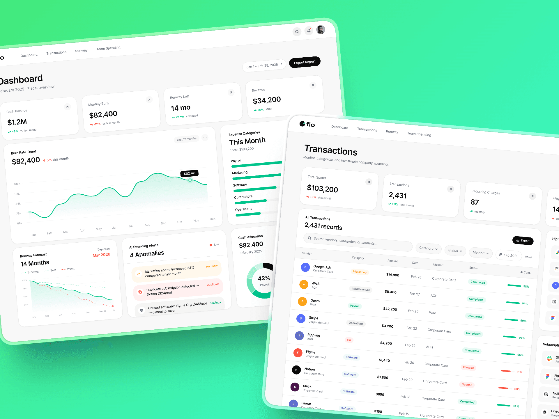
We mapped four core user moments- the morning check-in, the transaction audit, the runway conversation, and the board accountability question. Each moment became a view: Dashboard, Transactions, Runway, Team Spending. Nothing outside those four made it into the build.
UI Design
White base. Black type. Single green accent. No gradients. No decoration. Every design decision was made against one test: does this make the number easier to trust or harder? The AI Spending Alerts module was surfaced above the fold deliberately most dashboards bury anomaly detection. We made it the first thing an investor sees because it proves the product is thinking, not just displaying.
Prototype
The scenario builder was the feature that changed the pitch. Live sliders connected to real-time runway calculations. Move the marketing budget down 15%. Watch the runway extend by 1.2 months. The founder demoed this live. An investor asked a question. She answered it by moving a slider.
Delivery
Figma UX/UI across four views, complete design system, working Lovable prototype, exportable front-end code, live shareable URL, and a 60-second cinematic demo video. Delivered in 14 days. The pitch moved to a second meeting.
A pre-seed fintech founder came to MMStudio with a problem most early-stage startups know intimately but rarely talk about out loud.
She was tracking company spending across three spreadsheets, a Notion doc, and her bank's export CSV. Every time an investor asked about burn rate or runway, she was piecing together an answer from four different places live, in the room, under pressure.
She needed a product that made financial intelligence feel as simple as checking a dashboard. Not another spreadsheet. Not another integration. A real product she could demo, hand to investors, and eventually hand to a developer to build.
She had six weeks before her next pitch. She came to us with fourteen days to spare.
Discovery
The founder came in with a brief, a pitch timeline, and a problem. She had six weeks to her next investor meeting and no product to show. We ran a 45-minute brief session to define the one thing Flo needed to prove: that a non-technical founder could understand her own financials without a CFO in the room.
Information Architecture
We mapped four core user moments- the morning check-in, the transaction audit, the runway conversation, and the board accountability question. Each moment became a view: Dashboard, Transactions, Runway, Team Spending. Nothing outside those four made it into the build.
UI Design
White base. Black type. Single green accent. No gradients. No decoration. Every design decision was made against one test: does this make the number easier to trust or harder? The AI Spending Alerts module was surfaced above the fold deliberately most dashboards bury anomaly detection. We made it the first thing an investor sees because it proves the product is thinking, not just displaying.
Prototype
The scenario builder was the feature that changed the pitch. Live sliders connected to real-time runway calculations. Move the marketing budget down 15%. Watch the runway extend by 1.2 months. The founder demoed this live. An investor asked a question. She answered it by moving a slider.
Delivery
Figma UX/UI across four views, complete design system, working Lovable prototype, exportable front-end code, live shareable URL, and a 60-second cinematic demo video. Delivered in 14 days. The pitch moved to a second meeting.